
Katelyn Betz
Graphic Designer
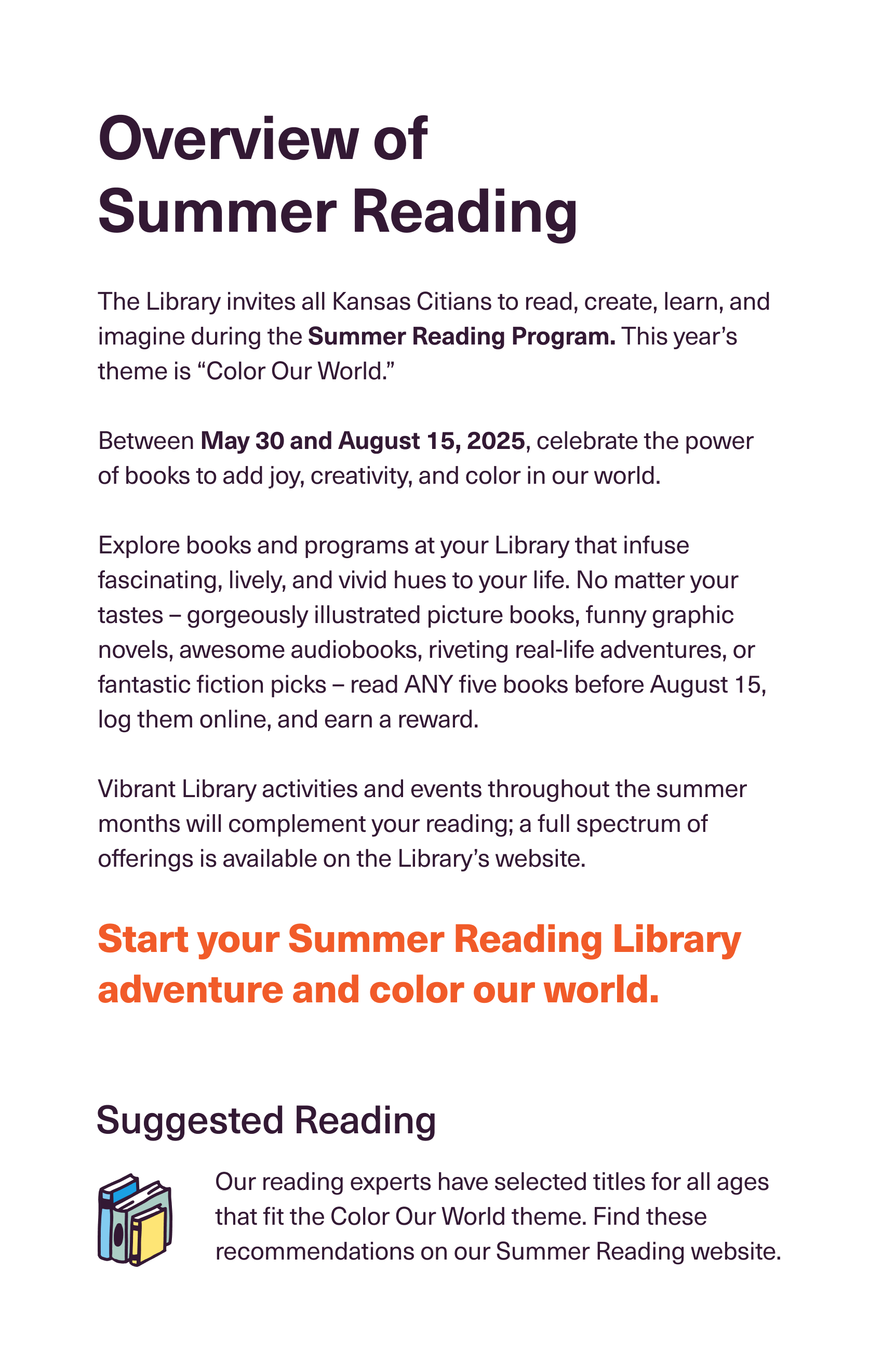
The Summer Reading Program at the Kansas City Public Library is a program that aims to bring literacy access, and the joy of reading to new and current readers in Kansas City. This year, over 13,000+ readers signed up.

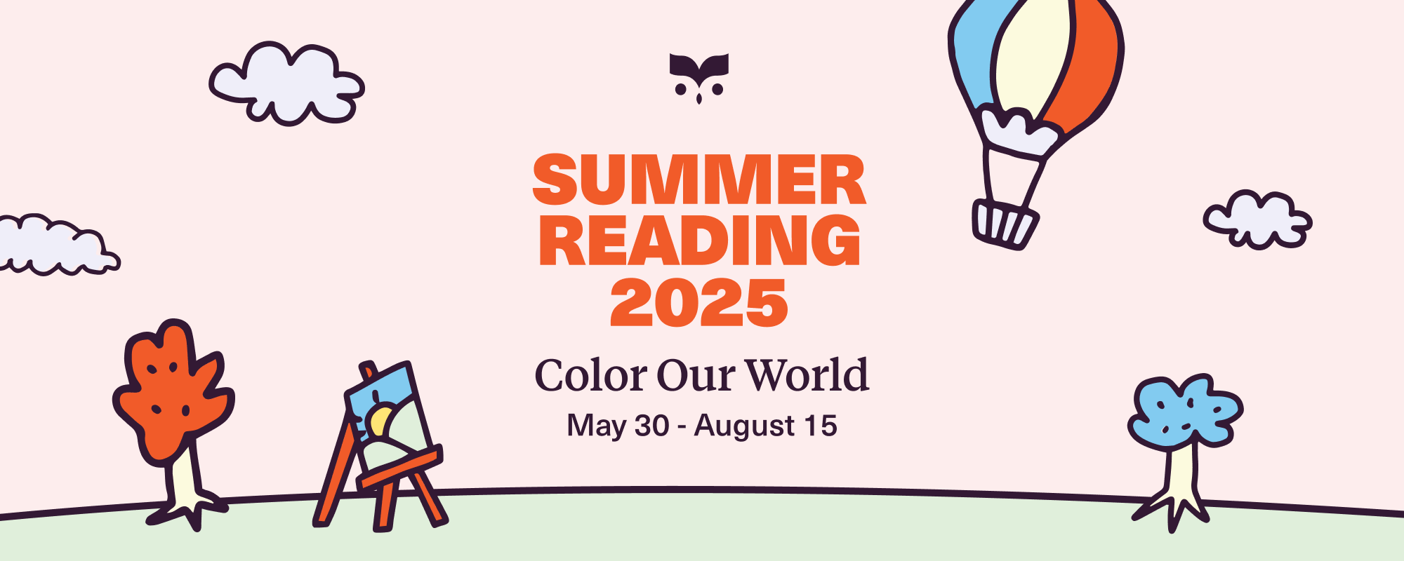
The theme this year was “Color Our World”. The design team, which consists of me and one other person, thought it would be beneficial to lean into the theme and take it literally. I created a series of illustrations that could be colored in by the participants.

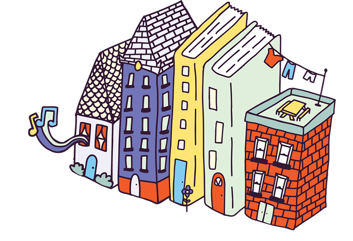
A unique element to this project is the need for creating user friendly templates and graphics packages for staff, so they can create flyers for their Summer Reading events. Because library staff are not designers, they need to be vector spot illustrations. This is so the illustrations and design elements can withstand being resized and placed into programs that the library staff have access to - such as Canva, Word, and Powerpoint.
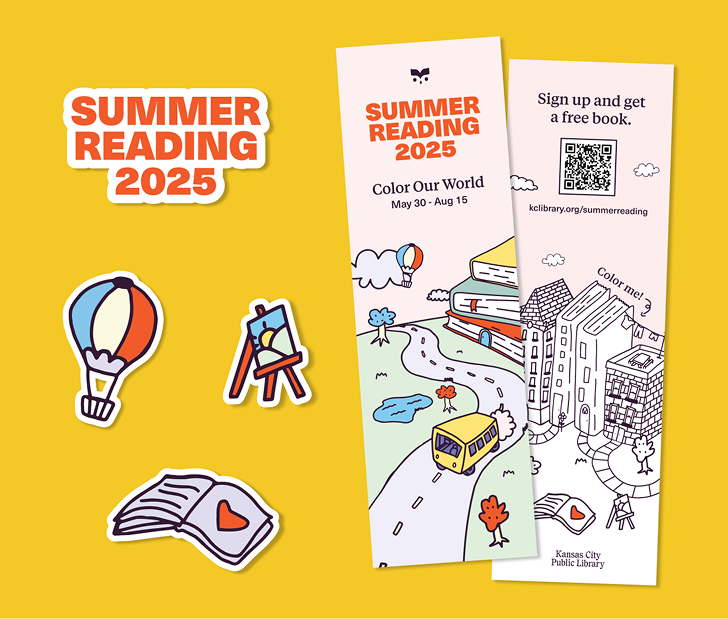
Stickers of the illustrations, and a bookmark that has one side for coloring in.
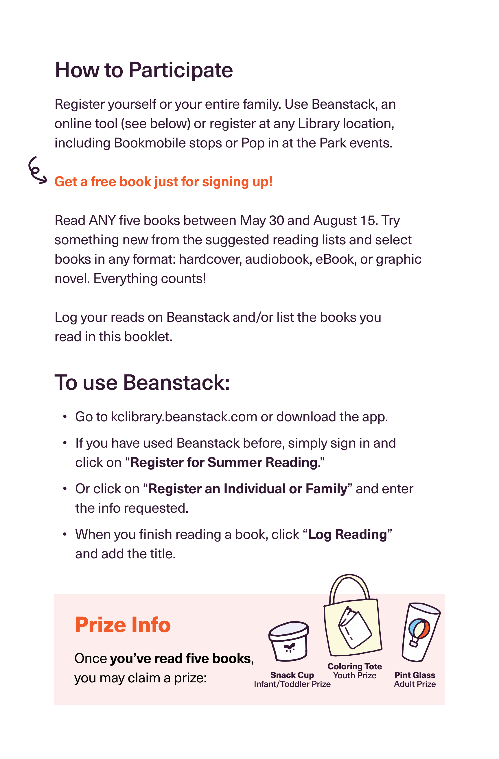
This is a page inside of the Summer Reading booklet for the participants. This was a 12 page 5.5x8 bound booklet designed in collaboration with another designer. We made sure that the pages were not coated, since there are coloring activities inside.
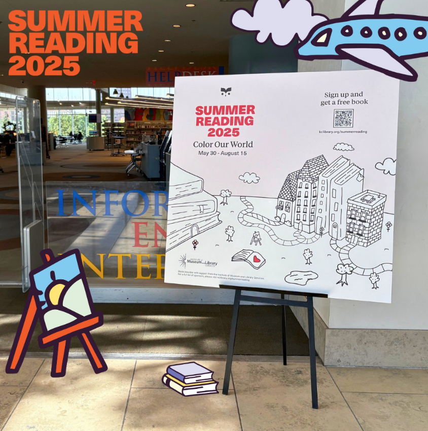
Interactive signs to advertise Summer Reading at all of the Library branches. By the end of the summer, the branches had their signs colored in by Library patrons.
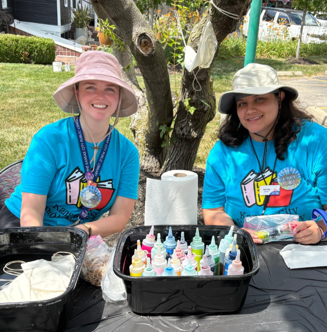
Library staff wearing the shirt designs.
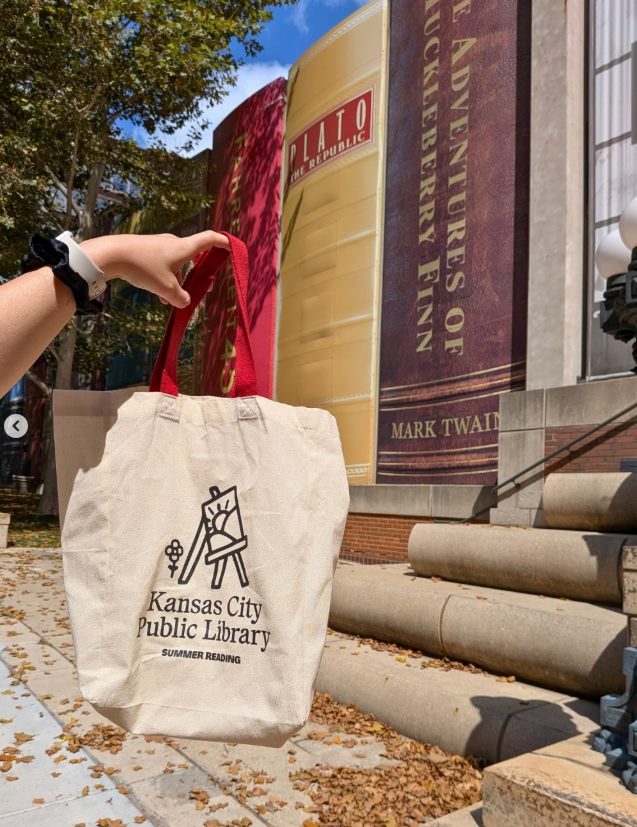
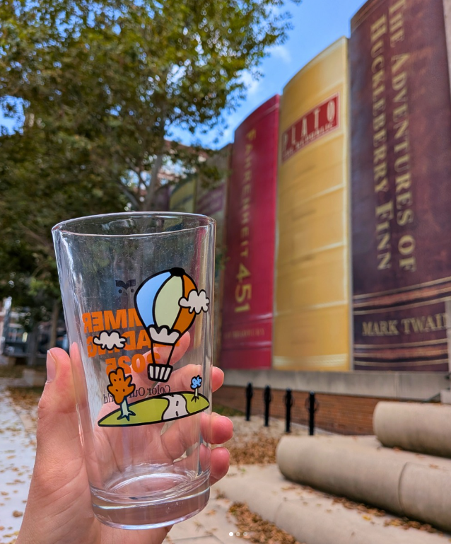
The tote bag and pint glass the readers can win when they complete the challenge.
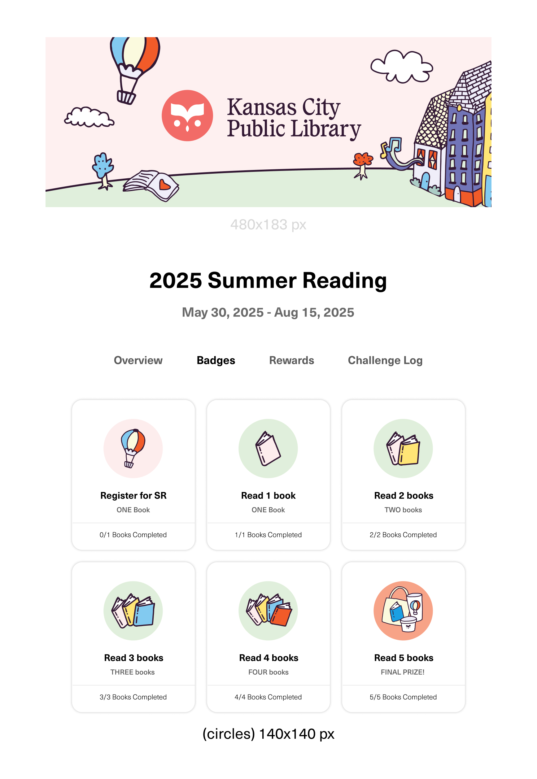
The Beanstack homepage with the illustrations where readers log their books.
We always want Summer Reading to bring in new readers, and keep engaging with current readers.
Because of this clear goal, I prioritize approachability with the design. I never want this to feel too refined, too cool, too polished. I want the readers of Kansas City to feel like they want to engage with the Library when they see these designs. I want my designs to speak to kids just as much as with adults, and this campaign successfully did that this year.


Subscribe
Katelyn Betz
Graphic Designer
The Summer Reading Program at the Kansas City Public Library is a program that aims to bring literacy access, and the joy of reading to new and current readers in Kansas City. This year, over 13,000+ readers signed up.

The theme this year was “Color Our World”. The design team, which consists of me and one other person, thought it would be beneficial to lean into the theme and take it literally. I created a series of illustrations that could be colored in by the participants.
A unique element to this project is the need for creating user friendly templates and graphics packages for staff, so they can create flyers for their Summer Reading events. Because library staff are not designers, they need to be vector spot illustrations. This is so the illustrations and design elements can withstand being resized and placed into programs that the library staff have access to - such as Canva, Word, and Powerpoint.
Stickers of the illustrations, and a bookmark that has one side for coloring in.
This is a page inside of the Summer Reading booklet for the participants. This was a 12 page 5.5x8 bound booklet designed in collaboration with another designer. We made sure that the pages were not coated, since there are coloring activities inside.
Interactive signs to advertise Summer Reading at all of the Library branches. By the end of the summer, the branches had their signs colored in by Library patrons.
Library staff wearing the shirt designs.
The tote bag and pint glass the readers can win when they complete the challenge.
The Beanstack homepage with the illustrations where readers log their books.
We always want Summer Reading to bring in new readers, and keep engaging with current readers.
Because of this clear goal, I prioritize approachability with the design. I never want this to feel too refined, too cool, too polished. I want the readers of Kansas City to feel like they want to engage with the Library when they see these designs. I want my designs to speak to kids just as much as with adults, and this campaign successfully did that this year.
Subscribe